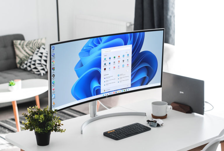
After six years during which Windows 10 remained largely unchanged, the world’s most popular desktop operating system is getting a major overhaul with the unveiling of “Windows 11“. That’s despite Microsoft proclaiming Windows 10 as the last version of Windows. No matter: After a couple years of ho-hum updates, the Windows-using world—at least some of it—has something to get excited about.
| Pros | Cons |
| 🗸 Beautiful, more consistent new design 🗸 New gaming and capabilities 🗸 Great window layout options 🗸 Better multi-monitor functionality 🗸 Improved performance features 🗸 Runs Android apps | – Requires recent CPU – Unfamiliar look may annoy longtime Windows users – Some useful tools going away |
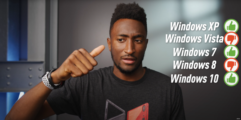
There is a lot of expectation from Microsoft for the next generation of Windows Operating System & as per Marques Brownlee their track record hasn’t been great, can this version of Windows break trend?
That said, when I first ran Windows 11 I was surprised that it still wasn’t that different from Windows 10, despite its very new look. Not as much as we’d expected it to be. Sure, it looks nicer with rounded corners for all windows, the taskbar icons in the middle, and more elegant Settings dialogs, but it didn’t feel totally alien or require a whole new process the way Windows 8 did. The following review are purely from my own experience after using Windows 11 now for over 30 days, there’s been three more updates for the dev channel, where it brings back the search bar to the start menu, more refinements to the new design across the menus, alongside better multi-monitor support for the taskbar, alongside many fixes, lets dig into the review then.
Cut to the Chase
- What is it? Windows 11 is the successor to Windows 10
- When is it out? Likely late October
- How much does it cost? Free
A New Look (and More) for Windows
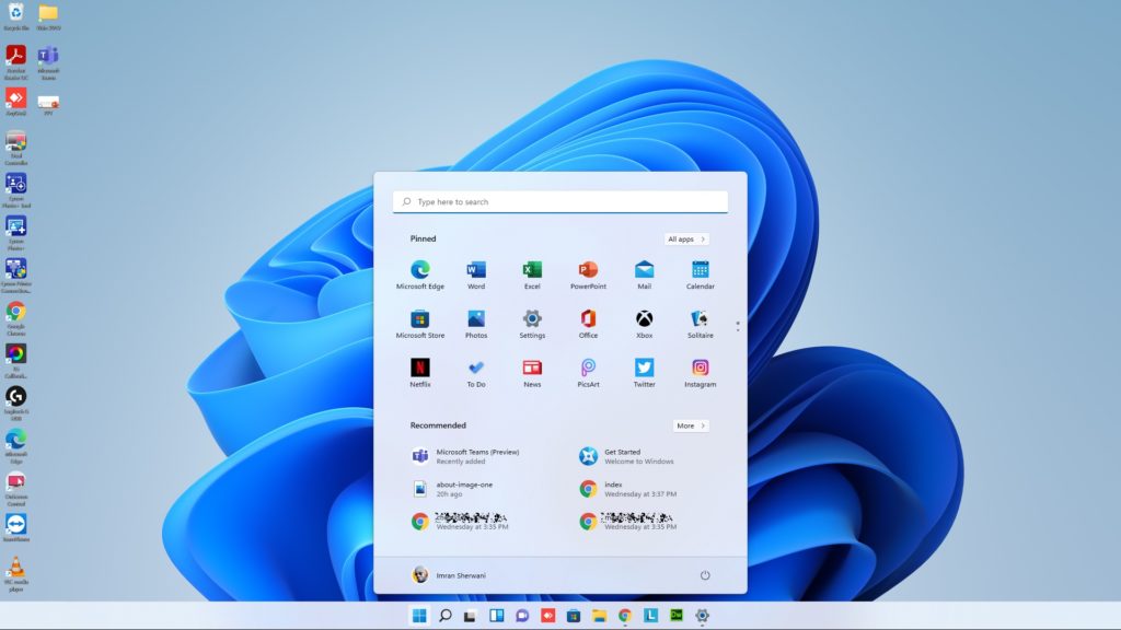
Much of the work is interface redesign rather than actual features, and—as I mentioned above—Windows 11 is more familiar than you may expect, despite some rearranging and updating the furniture. It borrows from Chrome OS, though the desktop still offers app icons, which Google’s lightweight desktop OS does not. Windowing and multitasking are still far more advanced in Windows, too. The interface gets macOS’s rounded corners for all windows, which is not really a significant change, but does give the OS a softer look. Much of the new design brings a welcome new slickness and consistency to the Windows interface, but there are a couple changes of which I’m not a fan.
Taskbar, Start Menu, and File Explorer
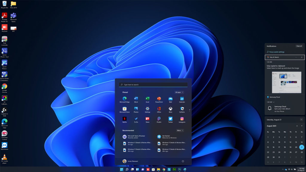
For decades, the Windows Start button has lived in the lower-left-hand corner of the screen, so, small detail though it may be, getting used to it being at the left edge of centered icons could be one of the bigger adjustments you’ll need to make. The issue for me is that the Start menu has heretofore always been in the exact same place, but now, if you run more programs, it moves a bit more to the left. Not having to think at all about the Start button’s position was a plus in all previous Windows versions. Happily, a Taskbar alignment option lets you go back to having the Start button in the left corner.
I’m also not crazy about the new taskbar, with its smaller, less-informative buttons. With Windows 10, it’s totally clear which programs are running, as their taskbar buttons are much wider. You can still hover over the buttons to see a thumbnail of the app window and right-click to open the jump list with recent documents or other common actions for the app.
During Microsoft’s unveiling event for Windows 11, Teams was prominently in the center of the Taskbar by default, but that feature isn’t yet in the prerelease build so I can’t comment on it. It’s a move that makes sense though: With the increasing importance of virtual meetings, maybe Microsoft can grab some of that videoconferencing market. Adding a Skype meetings button to Windows 10’s notification area didn’t seem to work yet in testing, however.
The Start menu gets a major overhaul in Windows 11. Vestigial tiles are at the top of its panel, with recent and frequent apps and documents below them. The Start menu’s new mini-tiles are still good for touch input, but you lose info that live tiles offers, annoying as those could sometimes be.
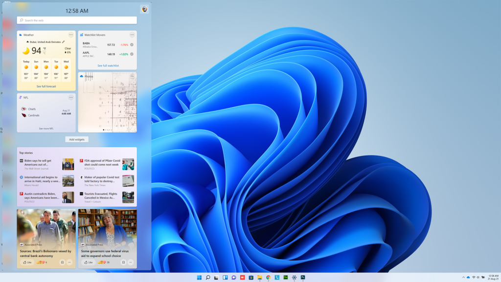
Widgets
Notification and Quick Settings
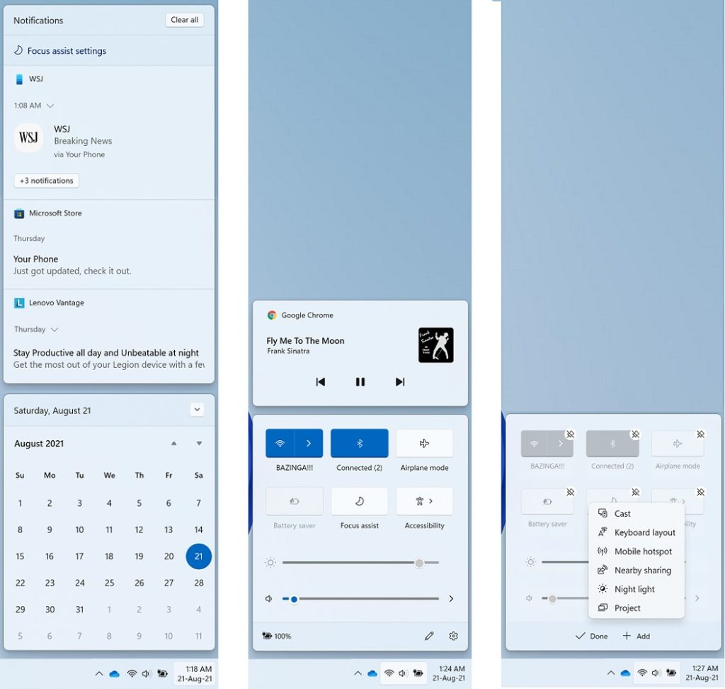
Microsoft has split the Windows 10 Action Center into two separate panels and tap targets. This resembles what Apple has done with macOS’s notifications, which used to be a clean, simple, single panel, but which are now a collection of smaller popups. The Windows 11 version isn’t quite as bad as the macOS one, but I still prefer the single Action Center panel for notifications and quick settings. I appreciate the circled number—similar to those on some mobile app icons—that shows how many notifications you have. Touch users can swipe in from the right to display the Notifications panel.
The Quick Settings panel opens when you click on or tap the Wi-Fi, speaker, or battery icon. By default, it shows buttons for Wi-Fi, Bluetooth, Airplane mode, Battery Saver, Focus Assist, and Accessibility, along with sliders for speaker volume and screen brightness. A pencil icon lets you customize what buttons appear, with a choice of Connect (for external displays and audio), Keyboard layout, Nearby sharing (like AirDrop for PCs), Night light, and Project. You can still hover over each of the three icons in the taskbar to see their status, but I prefer to have sound settings pop up when I hit the speaker and Wi-Fi options to appear when I hit the Wi-Fi icon.
Connectivity – Teams
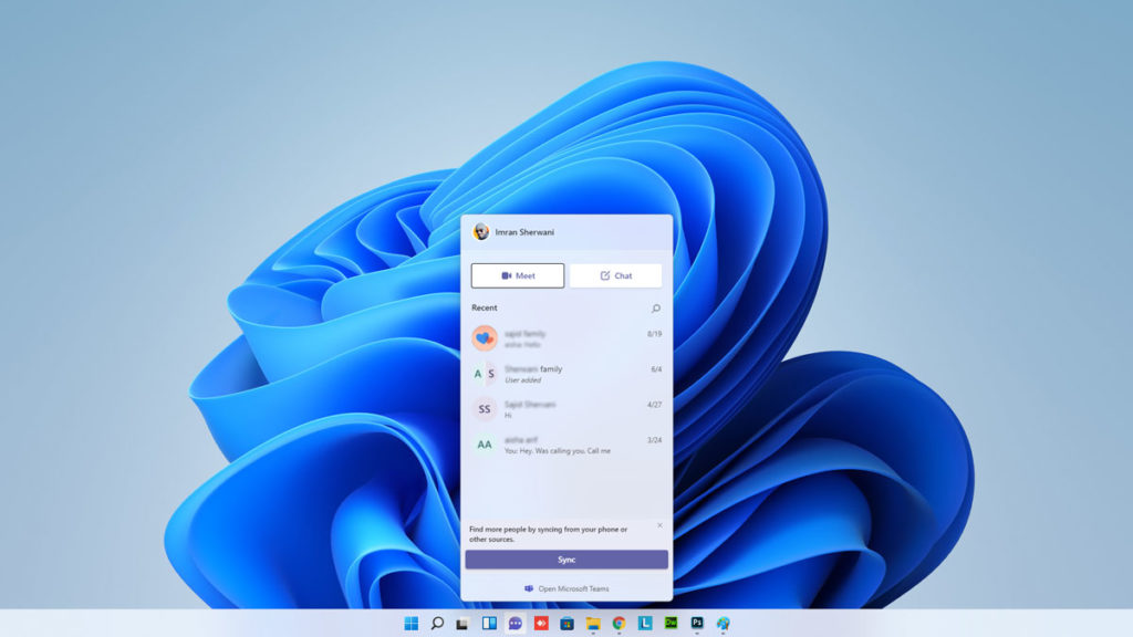
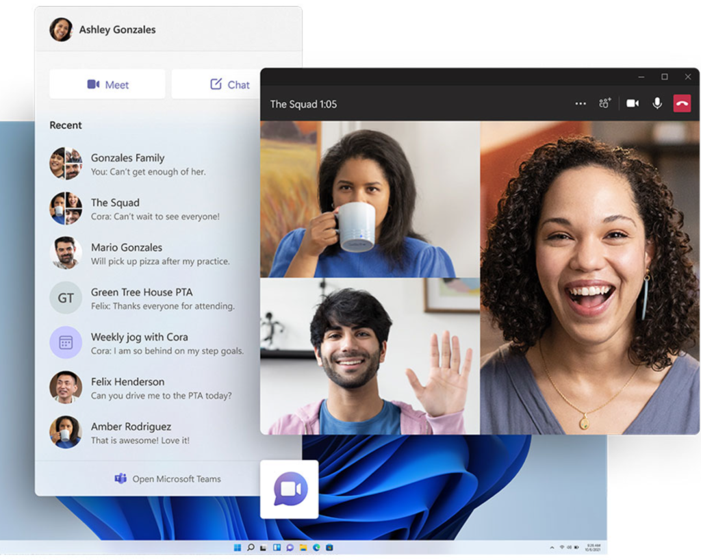
Teams is also integrated to the dock, so you can easily join in with meetings and family calls. This looks like the first inkling of Skype disappearing from Windows, especially with the Skype sounds being heard in the demo when a call was incoming.
Settings
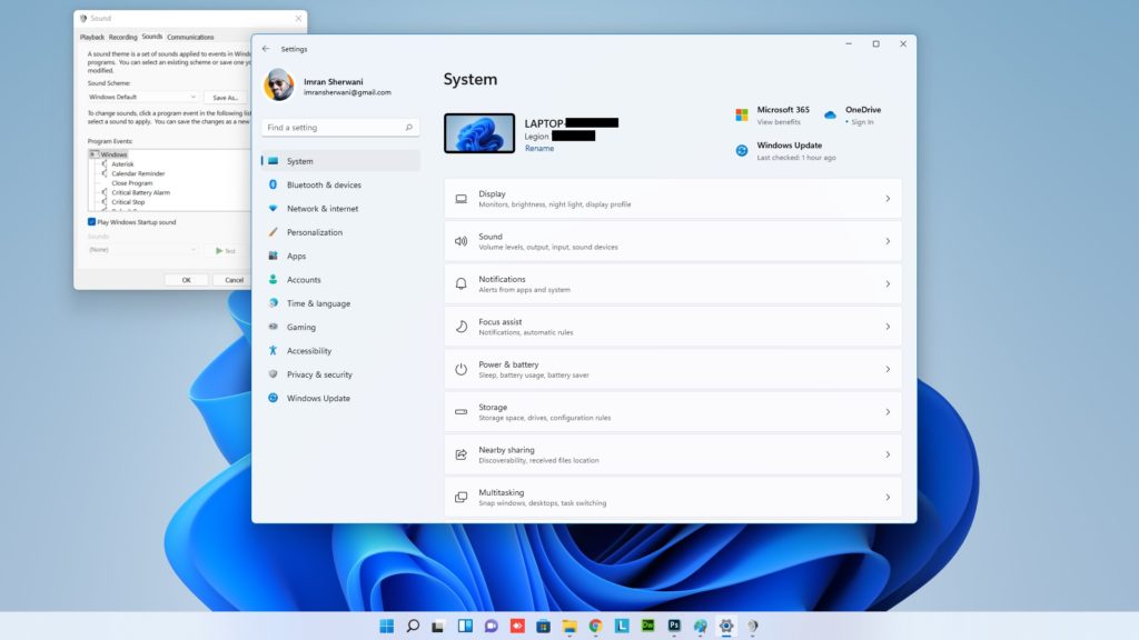
One of the more irksome things about Windows 10 has been its inconsistent settings windows and dialogs: Sometimes you uninstall a program in the new Settings app, sometimes in the antiquated Control Panel. That inconsistency goes away in Windows 11—almost entirely. For some detailed controls, such as sound devices, you still see the contents in the old style, though the window has the new design.
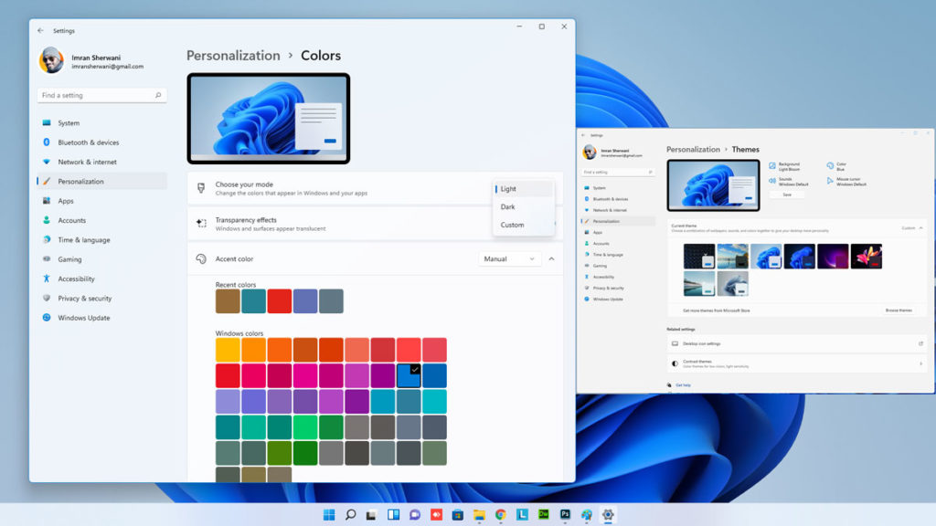
Light and Dark mode settings are still found in the Personalization > Colors setting area, and the modes look much better than in Windows 10, particularly the dark mode, which uses transparency effectively. Dark mode can now hold its head up proudly when compared with that of macOS.
Health Check App
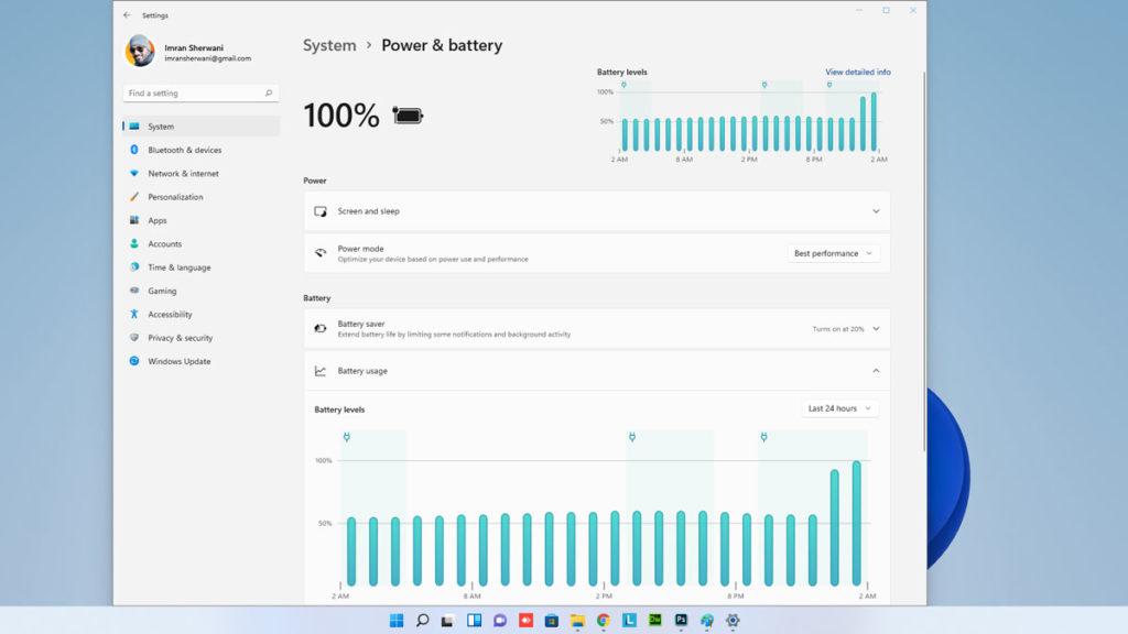
There’s now a much-improved health check app found in Settings, where Windows 11 will recommend you to turn down the brightness for example, change the power saving mode of the battery and much more.
Layouts and Multitasking
Windows has long surpassed macOS in the way it lets you arrange app windows on-screen, and the gap grows even wider with Windows 11’s new Layouts option. You get to this by hovering the cursor over the maximize button at top right of any window—this seems a bit hidden to me, and I hope and expect Microsoft will surface the capability more in the final release. When you do hover over the maximize button, you see a choice of layouts—two windows side-by-side, three with one large and two small, and so on as shown below.
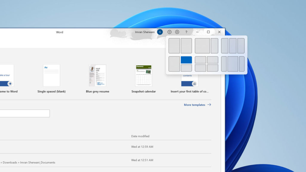
The current app window goes to the position in the layout you click (shown as blue here), and you can move it to another position the same way at any time. After you have a set of apps in a layout, you can hover on any of their icons in the taskbar to see the layout group to easily restore the windows arrangement, in what Microsoft is calling a Snap Group. You can load these on a second display you’ve docked your PC to, as well. Windows 11 also improves docking by remembering the layouts you had on the external monitor even if you didn’t specify a Snap Group. Thankfully, you can still snap a window to the side, so that it takes up exacty half the screen.
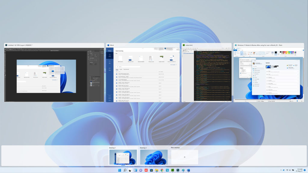
Windows still offers multiple virtual desktops, something I find incredibly useful for separating work apps and websites from personal ones. I either hit Ctrl-Windows Key–Arrow to move back and forth between them or the Windows Key–Tab keyboard shortcut to choose one from Task View. With Windows 11, you can now use a four-finger swipe to move back and forth, something Mac users have long enjoyed, though only via trackpad rather than right on the screen. Also new is the ability to set different desktop backgrounds (aka wallpapers) for each desktop.
New Store and Android Apps
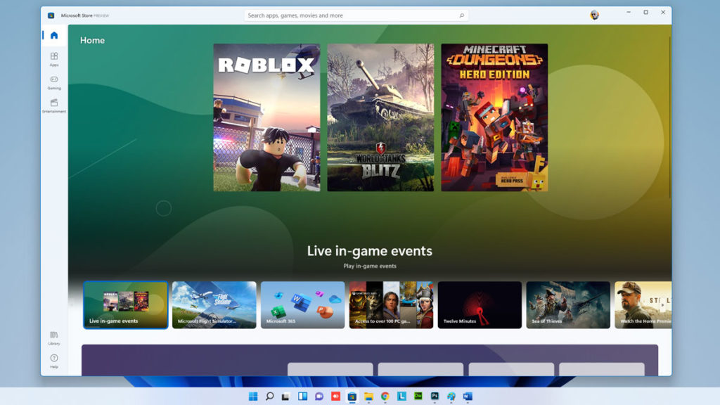
One marquee feature is that Windows 11 will be able to run Android apps, though with some caveats. You’ll either have to install them via the Amazon Appstore running inside of Windows’ Microsoft Store or as a sideloaded APK. Like the rest of the interface, the Store gets a slick design refresh, but in the preview build, the Android apps aren’t yet available. Note that in addition to apps, the Store offers Movies and TV as well as games.
One app that Microsoft has indicated will be installed (and front and center in the taskbar) is Microsoft Teams, the company’s video calling and business messaging service. Teams grew phenomenally during the COVID pandemic, from 20 million to 145 million active users, but it remains to be seen whether it can become as ubiquitous as Microsoft would like.
You also get all the standard apps like Photos, the Groove Music player, Voice Recorder, Paint 3D, Mail, Calendar, and so on. We can hope for the last two mentioned to be greatly improved as Windows 11 development progresses.
Gaming and New Technologies
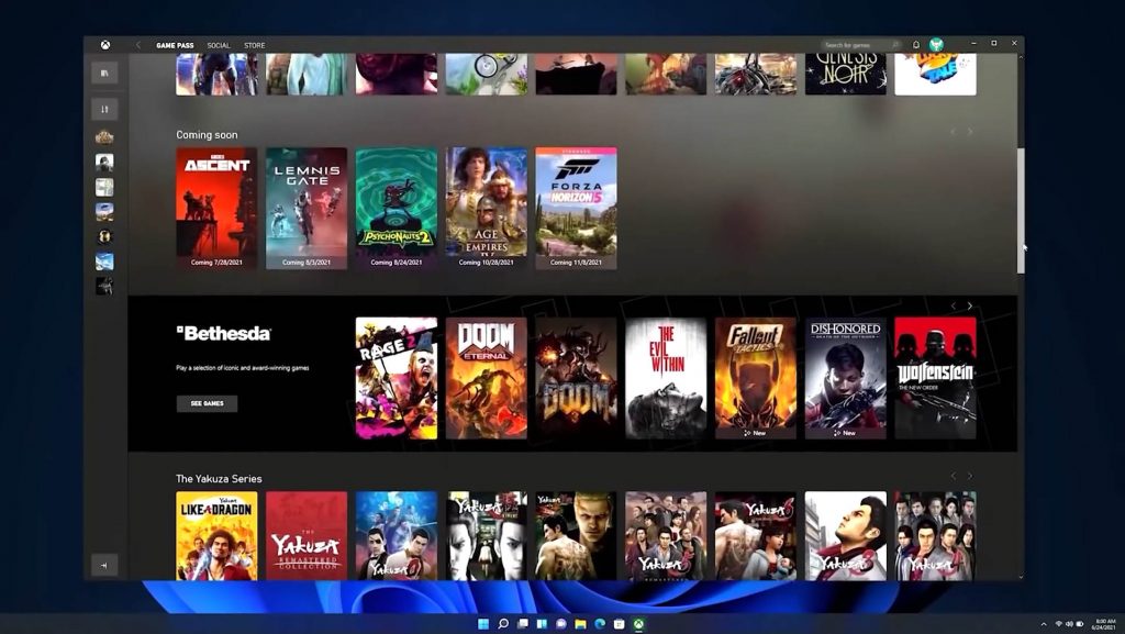
PC Gamers are never forgotten in major new Windows updates, and Windows 11 is no exception. Two areas benefit: Game selection and technologies. For the first, the Xbox app built into Windows 11 will offer access to the Xbox Game Pass collection of videogames. This will include titles like Halo Infinite, Twelve Minutes, and Age of Empires IV. The app will also enable Xbox Cloud Gaming, Microsoft’s streaming game platform.
As for new gaming technology, Windows 11 will introduce Auto HDR and DirectStorage. The first expands the color space to reveal superior clarity even with non-HDR game titles. The second technology, DirectStorage (a subset of the Xbox Velocity Architecture) will speed up game loading times by bypassing the CPU and allowing graphics memory to load directly.
Other technical advances in Windows 11 include Dynamic Refresh, which will save laptop batteries, by decreasing a screen’s high-refresh rate when it’s not needed. The OS will also support the much faster Wi-Fi 6E standard. The requirements of TPM and Secure Boot are part of Microsoft’s beefing up the OS’s security technology, a topic worthy of a whole separate article.
What’s No Longer There?
A couple of windowing conveniences that I personally like but are apparently little used are going away. Aero Peek and Aero Shake are gone in the Windows 11 preview build I tested on. On my test laptop, Cortana was indeed preinstalled since it was previously installed, but Microsoft says the AI voice assistant won’t be preinstalled on Windows 11 systems. Live tiles are gone, too, with Widgets now replacing their functionality. No doubt there will be more features put out to pasture by the time Windows 11 is released.
Time for a New Windows
Minor complaints aside, it’s good to see Microsoft putting serious attention into its marquee software: For the last few years, the company has been putting more work into its Azure cloud computing services—justifiably. Perhaps Microsoft will lure away some Chrome OS users or even— dare we suggest it—Mac users? Aside from the slick new looks, there are useful new tools and capabilities, as well as performance advances—many more than can be discussed in a preview. It’s still very early days for Windows 11, but even now, the next version of the desktop software used on 1.3 billion PCs is impressive. Watch for frequent updates to this preview and for a head-to-head comparison with Apple macOS Monterey and ChromeOS, too.
Minimum Specifications required for Windows 11
There’s been a lot of discussion as to which devices are eligible for Windows 11. Regardless of the TPM requirement, others are simply wondering if they need to look to upgrade their PC or laptop soon.
For now, Microsoft have published the requirements for the update, but they are subject to change as we near release and the company take feedback on board.
- Processor: 1 gigahertz (GHz) or faster with at least two cores on a compatible 64-bit processor or SoC
- RAM: 4GB
- Storage: 64GB
- System Firmware: UEFI, Secure Boot capable
- TPM: Trusted Platform Module 2.0
- Graphics Card: DirectX 12 or later with WDDM 2.0 driver
- Display: 720p, 8-bit per color channel, at least 9-inch diagonal
- Internet Connection and Microsoft Account: Windows 11 Home requires an active internet connection and a Microsoft Account to complete initial, first-use setup of the operating system, or when switching a device out of Windows 11 Home in S-mode.


